
This week I'm going to start with some more colour theory that may be helpful to you when you are choosing colours to put together in:
knitting/crochet designs
Quilting & stitching
Spinning & felting
Beading & jewellery making
Decorating - interior etc.
I have found, after over thirty years in a variety of design fields, that the main component of any memorable design is contrast.
To make contrast work for you you need to break it down in to 5 main parts.
These are Tone, Size, Shape, Texture & Colour.
For a design to really work one element has to dominate.
Today we'll look at TONE
...................................................................................................
Tone
Tone is basically light & dark.
It is made interesting according to the of amount of light & dark you have in a piece.


It can create drama
When used with minimal colour tone is really important.
It can create drama or a sense of light & space.

When combined with other contrasting elements, it can make or break a successful design.

This painting works because it uses contrast of colour - blue/greens & warm browns.
Contrast of shape - long straight lines with rounded lines & shapes at the figures feet.
Contrast of visual texture - the rough texture of the rocks behind Circe contrasting against her smooth youthful skin & the liquid she is pouring & standing on.
The artist has also used contrast of tone - by having a dark background the figure comes to the foreground but you notice first her face, hands & feet due to their pallor.
This is one of my favourite paintings.
I can hear my NCH (Non Crafting Husband) sniggering,- I have hundreds of favourites in different genres.
Note - I said one of my favourites.
It is a painting of 'Circe'.
She is a character from Homer's 'Odyssey'. She was painted in the act of poisoning the sea. Hence the heightened sense of drama.

Here the contrast of light & dark is used to great effect with contrast of size.
This picture works because the light area is much bigger, & it is balanced by the finer details of the tree's branches, plus the bird.
This is an example of tone where dark dominates - they are high contrast.

Misty valleys (above) - see how the white clouds soften the scene.

Serenity in tone & colour

Snow is classic for making a scene feel quiet. You can also do this in a bathroom (see below)


By using the minimal darker tones at the front of the picture, the landscape appears to extend into the distance & create a sense of space.

This pair of socks uses more dark than light. If the toes were grey & the tones reversed the socks would appear lighter as a pair. I personally would make one sock with the dark dominating & one with the light dominating.
I think it would be more interesting.

In jewellery design, contrast of tone can work like this.
Using tiny dark beads & larger oval beads & the white pearls balance the darker tone to make a dynamic piece. This is a piece that I made using Botswana Agate, freshwater Pearls & Mill House glass beads.
Thus using contrast of tone, size & texture.

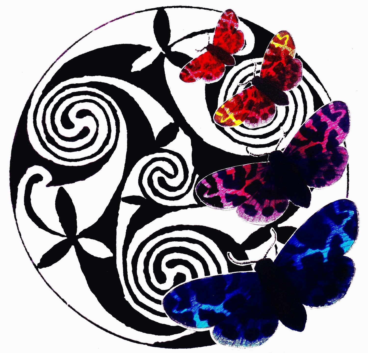
In this image the dark colours are dominant - the light colours appear more vibrant next to the dark colours. This is an example of contrast of tone, colour & texture.
The image looks like it is boiling while the edge of the shape is a serene smooth round.
Next time I will be concentrating on contrast of SIZE.
Narda.