
New thoughts & rethinking old posts.
So, here we are in Australia at the tail end of the Delta outbreak, now Omicron has raised it’s ugly head.
Christmas has snuck up on me - so I have no stock finished for my website, my Christmas list is lacking in detail & my head feels like it’s going to explode 😵💫.
I’ve been teaching heaps almost six days a week - sometimes four sessions in one day - all different mediums (crochet, stitching, dyeing etc).
I have loved teaching all those lovely people - but now I’m tired after 5 months straight.
So, I’m looking back to my favourite things. Colour especially.
Nothing has changed really - I still love colour & the way it affects me.
I am chatting today about colours I like to use.
It's interesting how different colours affect different people in different ways.
For example my Mum loved Yellow. For her yellow was a happy colour & it made her feel good. I think that is why Sunflowers were one of her favourite flowers.
I can see why - you couldn't feel droopy with these around could you.

These flowers always look like they’re smiling.
I always think daisies & big open flowers like this look like they are smiling.
But she thought purple was a depressing colour.
Now me, I find yellow a depressing colour & purple a colour that inspires me.
My favourite version is one that has plenty of blue in it.
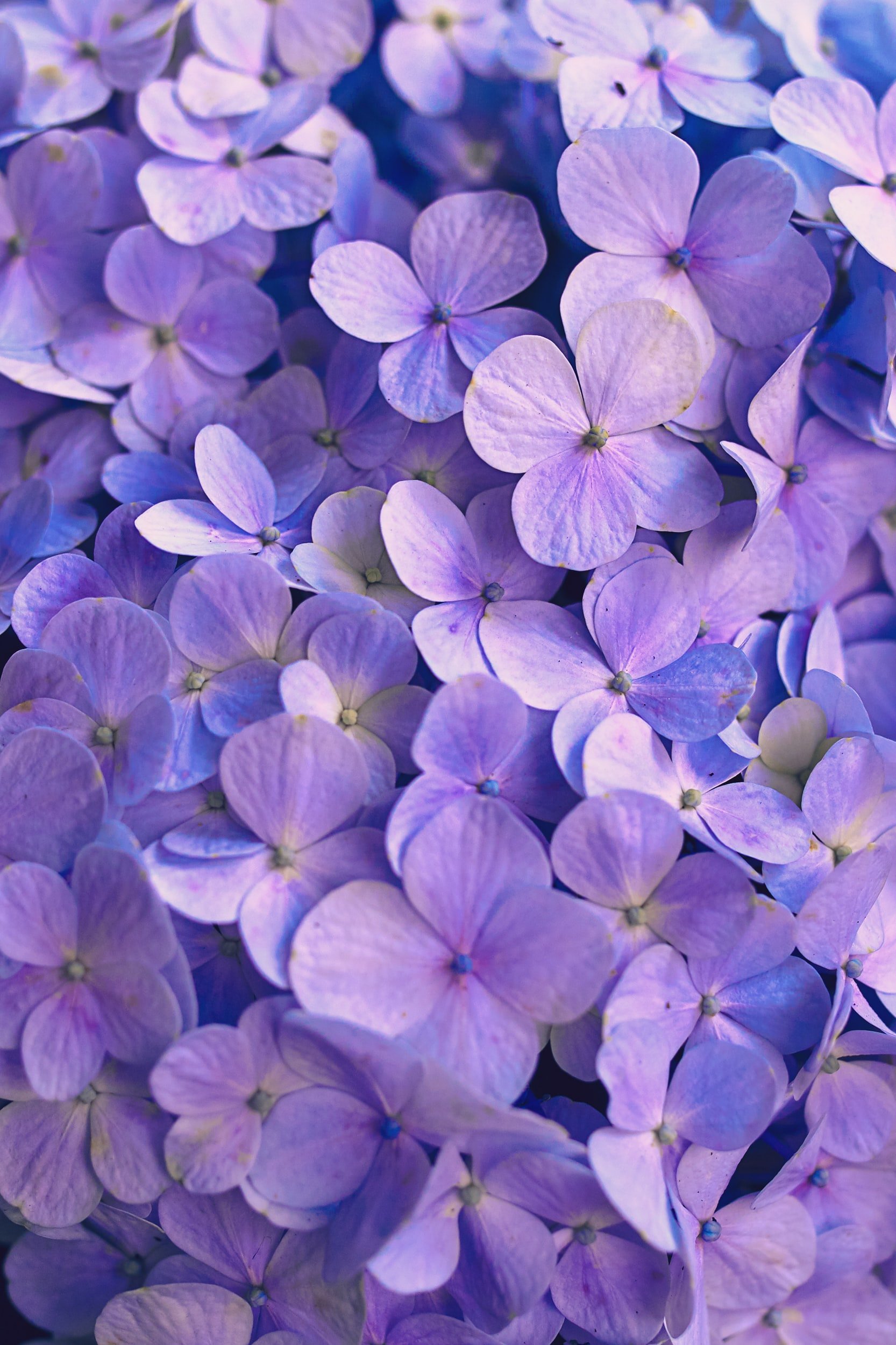
I find that my wardrobe is full of variants of blue, green & purple

The neutrals I wear tend to be black or grey.
This is because black makes colour more intense & grey shows colour as it really is.
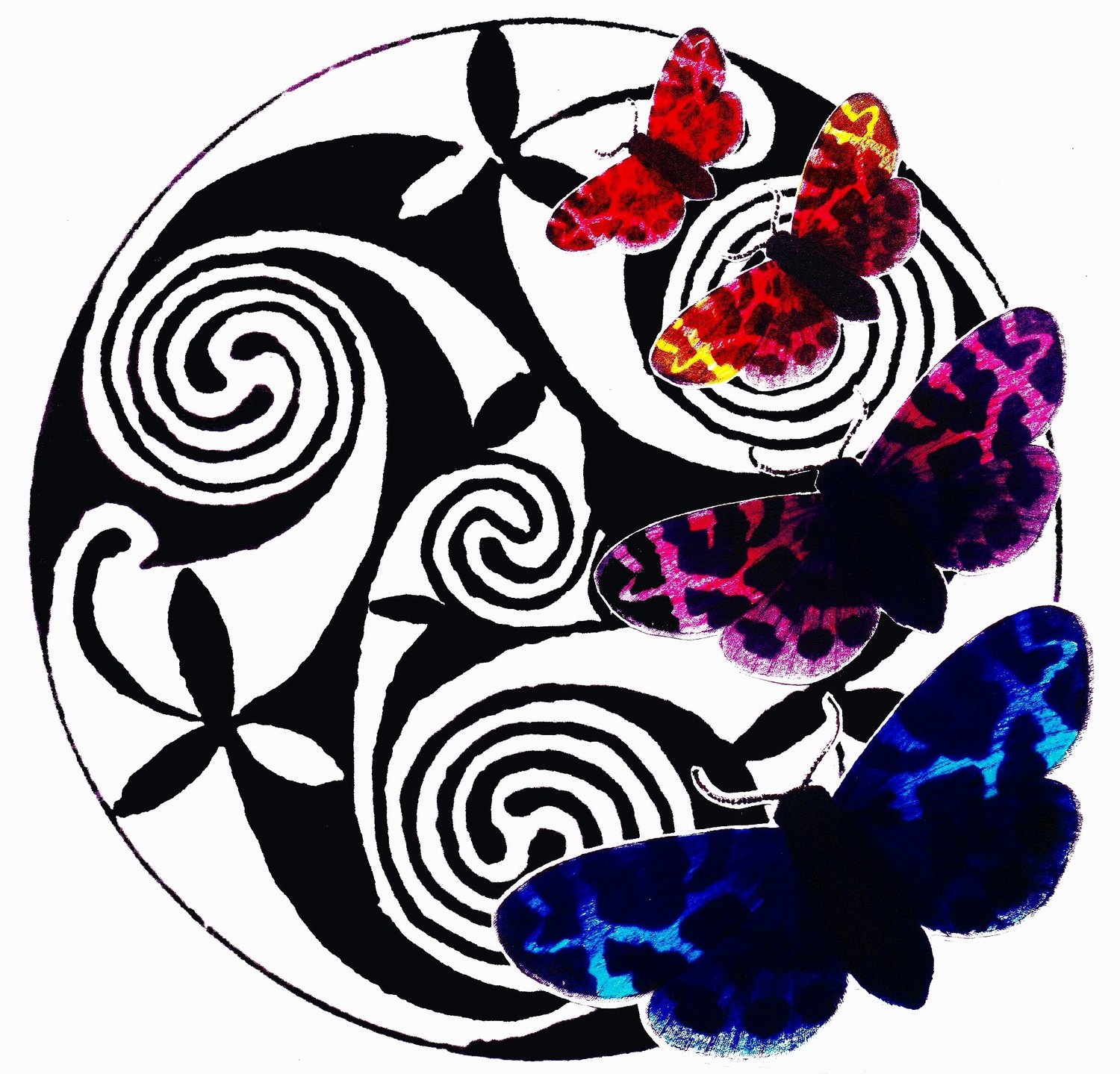
The great all rounder pick me up colour wise for me is red.

Not a whole outfit (though I used to have one), but just a touch to add vibrancy.
For me green is the ultimate soother.
The whole living area in my apartment are two different sorts of green.
Also I love blue & white china - which looks great on the sage green background.
Blue & white is a refreshing combination - the blue makes the white look brighter, the white makes the blue look richer - guess I like cloudy skies too.
So I find when I am designing I tend to avoid yellow.
Though just lately I have been forcing myself to use more yellow in my spinning.
I've been using the direct contrast mix - mixing a bit of purple into the yellow.

This softens the yellow & makes both colours look richer.
One of the most dramatic uses of direct contrast is shown by Prudence Mapstones' work (see below)
Have a look at her website - www.knotjustknitting.com
She has such an inspiring gallery page & she is such a lovely person.
She is often found with husband at her own stall at the Sydney Quilt & Craft Show.
She travels the world teaching people how to 'scumble'
- an almost sculptural method - have a look.
I'd love to hear what other people think.
What is your favourite colour - why?
I'll post some of my work again soon.


