
Today I am looking at the importance of contrast in size when used in design.

Contrast in size isn't only about how big something is but also how much of something there is.
This can create a focus of interest & can make a design more dynamic.
SIZE

In the image above there is different sized text in a variety of colours. If the text was all the same size, this design would be very boring to look at.
For a design to work - think of size in terms of amount (domination).

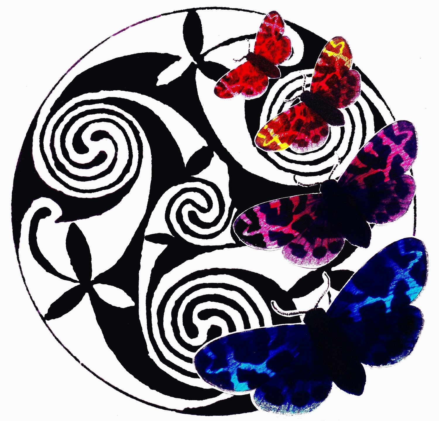
Here again in this example, you can see how size creates interest & draws the viewer in to examine each item.
Even though one colour dominates. The black background makes the colour appear clearer & the items appear more defined.
If it were on a white background, I think the effect would not work as well.
One colour needs to dominate or, one texture, or one tone, one shape.
For example:

In colour you could have something like this (see above)-
This is a brooch made using gold & silver, these act as neutrals in this piece.
The dominant colour is BLUE (lapis lazuli)and the contrast in both colour & amount or size is ORANGE (- in this case coral & carnelian). A couple of moonstones & a pearl have been thrown in to act as a tonal contrast.
There is also contrast in shape - rounded vs angular.
Note the circular shapes dominate.
Then to top the design off you have contrast of size - this makes the design more interesting & draws the viewer in.
..............................................................................................................
To see this contrast of size as amount in knitting -

These stripes look fine on a child this age - because the stripes are even in width, no one colour dominates. it makes the design predictable & just a little boring.
This would make me look like the side of a bus.

These stripes are more successful as a wearable because the edges of the colours are softer & one colour - in this case the neutral browns - dominate.

This outfit is lifted & the green appears more vibrant through the use of a small amount of contrasting colour in the scarf.
The contrast of size is also in the size of the motif or surface design.
A contrast will always draw the eye
- so you need to put it where you want the attention.

It is important to look at where you are going to put the contrast in size.
This example (right) always makes me feel sorry for the model.
What a place to put horizontal patterns!
Because the pattern is wide & heavy is makes the bottom of the pullover look broader.
I think the pattern on the sleeves is in the wrong place as well.

A better place for this kind of work is at the top if you want to draw attention to your face.
or
As in below - the motif becomes smaller & the grey dominates, making the design appear lighter & more flattering.

This Swedish designer is great at putting colours together in such a way to create vibrancy.
https://www.gudrunsjoden.com/global

You can see here that red dominates.
Look at the way she uses contrasting motif size as well.
She uses contrast of colour, size, line weight etc.
Here are some images of Jenny Kee (Australia's version of Zandra Rhodes).

The red dominates & is made even brighter by the amount of black.
I love her work - it is dauntless in the face of bland corporate wear.
She has a gift with using contrast to create dynamic, exciting designs.

See? Size does matter.
If anyone has any questions about this stuff please post a comment & I will answer it with examples etc.
That's all today,
Narda.