
For a design to work well as I have mentioned before, you need at least two or three of the five basic design elements combined. Also that ONE element must dominate or the arrangement will look messy or fussy.
So today I am looking at SHAPE,(it could also be described as direction of line).
As I have written in previous blogs, wherever the contrast is - that is what draws the eye. Shape can be used as a tool to draw the eye to where we want the focus.
For example;

The contrasting shape here are the directions of the dominant lines - curved horizontals & the narrower columns holding up the boxes. The dominant shape is the horizontal, it takes a bit longer to see the uprights.
Because the dominant shape is the broad lines of the edge of the theatre boxes they draw our eye to the main focus - the woman on the right hand edge of the photo.

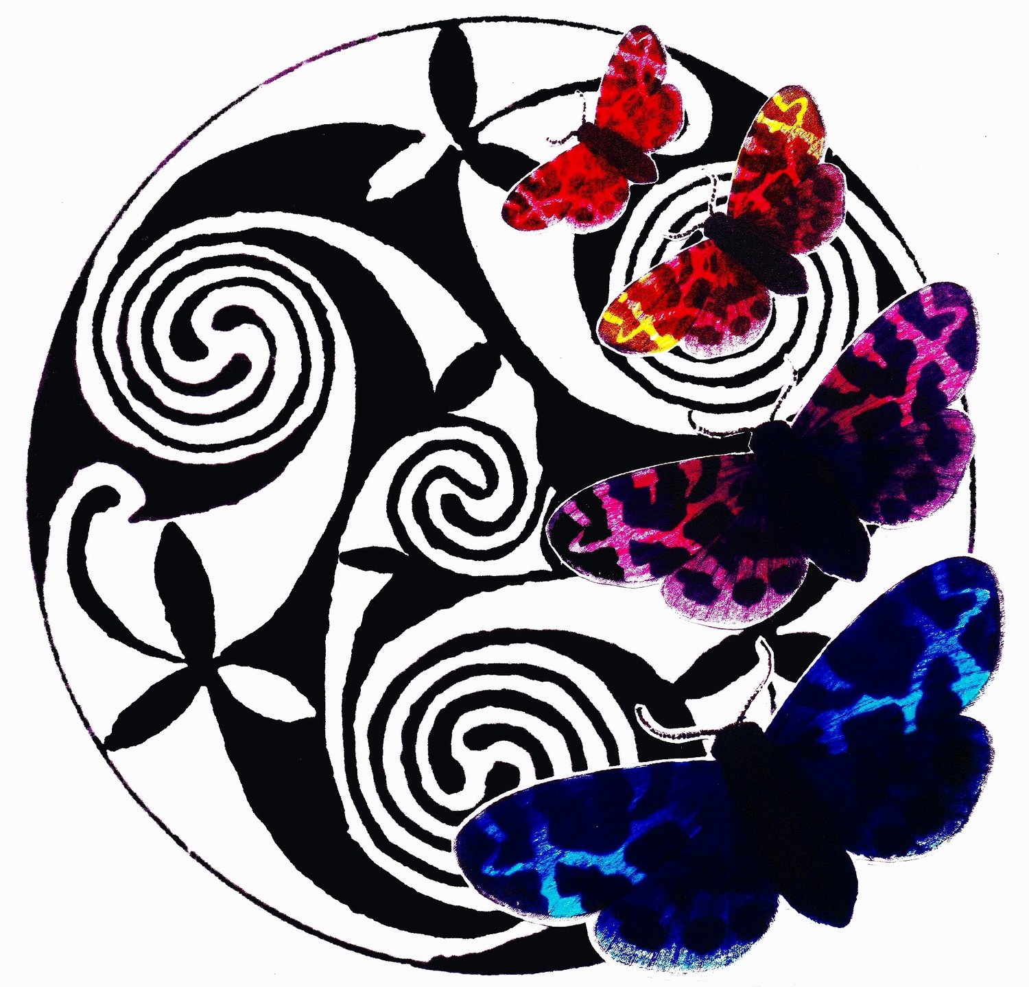
In this piece of stained glass by Frank Lloyd Wright - the contrast between the shapes is really clear.
Circles Vs Rectangles & squares.
Also the arrangement of colour & tone is used to create a dynamic piece to look at.
He has used pure chroma colour & has put it into a frame which uses only black & white as a background.
I imagine as a window this would work well.
The clear light would come through the bottom of the frame & all the light coming through the beautiful colours could still be enjoyed.

This painting 'Contemplation' by Australian artist Brendan Mogg, uses shape not as a contrast but to focus your attention on the colours & the way he has positioned them.
When I look at this picture without my glasses on (or squint at it), it makes me think of an exploded photo - pixels everywhere.

Ton Schulten has used contrast of direction of shapes to make up his lanscapes - horizontals & verticals.
The strong verticals draw the eye in & the use of colour - the blues create deepth as the warm colours come forward.

Janet Ledger's 'Big Red Bus' uses dark tones & strong horizontals to make the big red bus a focal point. The rough person shape also draws the eye because it is not based on straight lines.

Carl Larsson (one of my favourite artists) uses the contrast of the busy lines of foliage in the background to bring the figures in the foreground to our attention. The shape of the cloak is fluid & smooth & so captures your eye &makes it explore the figures. Notice how he has used contrast of colour as well.
In using the same principles in knitting & crochet we can see some interesting results.

In one case that I remember the results were unfortunate.
Have a look.
This unfortunate jumper/sweater is an example of contrasting shapes drawing the eye.
As I have mentioned before - this pattern would have been more sucessful on the upper part of the body. See below.

Here (right), the contrasting shapes & colours on the yoke are what draw the eye.
The blocks of colour here contrast with the large block of colour - the contrasting strip at the bottom of the hem & sleeves add interest.

This laced edge cardigan has been given added interest through the use of the pattern on the edge of the neckline. Even though the piece is all one colour the contrast to the flat stocking stitch makes this more dynamic. I wouldn't mind making this one myself.

Here are some Interiors using contrast of Shape -
(Right) A restaurant interior.
Restaurants are often more adventurous as they are interiors that we don't live in full time.
Here is contrast of colour + contrast of shape, makes this quite a dramatic space without being too heavy.

This interior uses a few elements of contrast
- Colour
- Shape/line/direction
- texture - flat surfaces Vs soft clouds & trees.

This interior uses predominately straight lines - the introduction of a runner made up of zig-zags makes this hallway interesting & leads into the next room. The round mirrors in black link to the runner.

A simple contrast of arches & straight edges.
I will leave you with this gorgeous example.
